


During a research project, I designed a poster made up almost entirely of typographic elements and formations.
This was a particularly fun project to work on, since I had the opportunity of finding new ways to make text tie into the subject matter that I was illustrating.
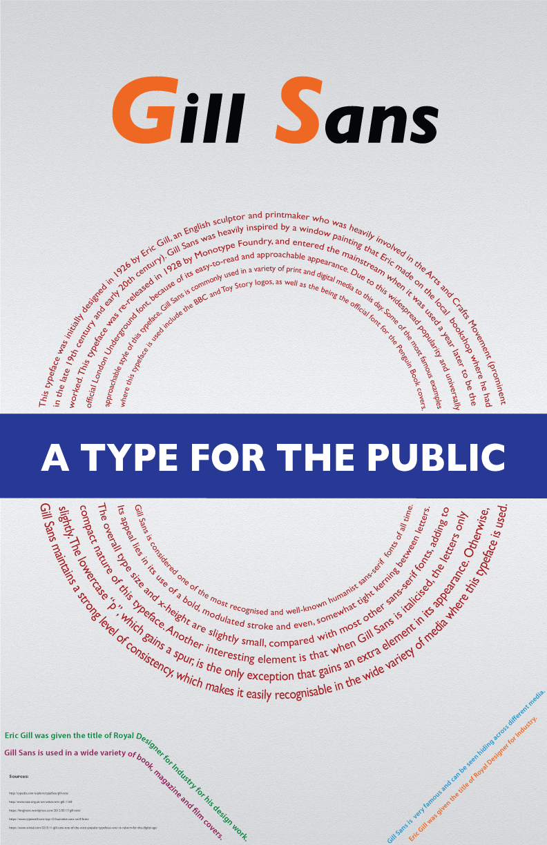
Gill Sans is a typeface that was designed in the 1920s, a decade commonly associated with novelty in style, fashion and commerce. Since this typeface is most most commonly associated with the London Underground, it can be seen as a typeface that connotes elements of speed, movement and efficiency. Gill Sans obviously takes pride in being a clear, easy-to-read and orderly typeface. Gill Sans is commonly used across various forms of media, such as logos (BBC, Toy Story) and literature (the orange-and-white Penguin book covers).
I look forward to working on more projects like these, since they allowed me to practise fun and dynamic new ways of presenting useful information.